AI for Exhibition Designers: Concepts, Walkthroughs, and Client Decks.
Exhibition designers are using AI to compress the concept-to-client-deck pipeline. Here is where Stensyl fits into that workflow.
Where Exhibition Design Workflows Actually Stall
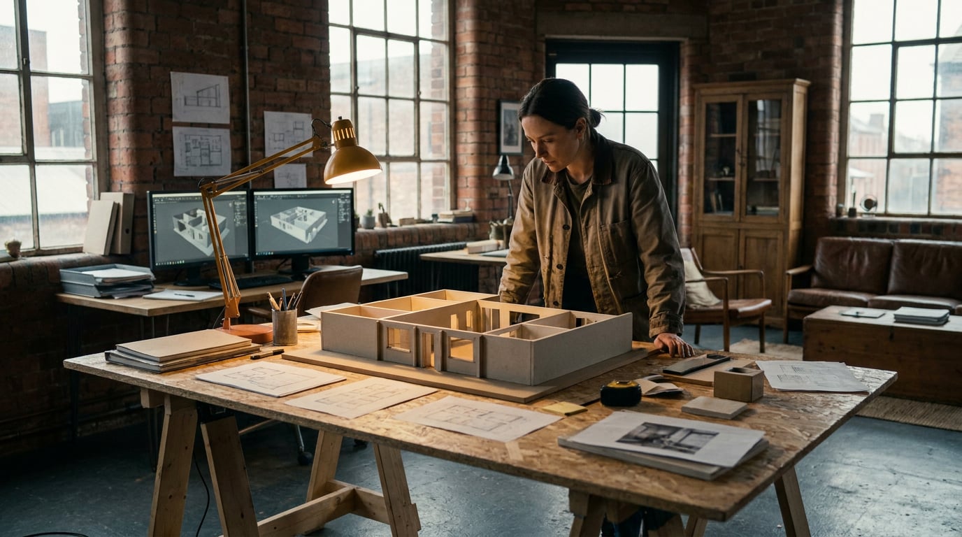
The gap between a client brief and a first reviewable spatial concept is where most exhibition projects lose their momentum. Not in construction, not in fabrication. Right at the start, in that one-to-two week stretch of sketching, blocking and deck-building before anyone has something concrete to react to.
The brief arrives. It says something like: "An immersive brand world. Premium but approachable. We want visitors to feel the heritage." And then it is your job to turn that into a floor plan, a material language, a lighting tone, an entrance sequence, and a narrative thread. All before a single design decision has been signed off.
Exhibition design has four specific bottlenecks that eat time at this stage:
- Mood alignment with marketing and brand teams. The brand team has a campaign direction. The stand designer has a spatial instinct. Getting those two aligned before the first concept presentation takes rounds of reference-swapping and scattered feedback.
- First-pass spatial visualisation. Entrance experiences, hero zones, key vistas. These need to exist as images before clients can engage with the concept, but generating them from scratch takes significant studio time.
- Panel and interpretive copy. Museums and cultural exhibitions especially need copy drafted early. Interpretive panels, zone introductions, learning outcomes. That work often sits in a queue waiting for the design to be finalised, creating a bottleneck at the end of the process.
- Walkthrough narrative for stakeholders. Non-technical clients cannot read a floor plan. A section drawing means nothing to a marketing director. They need to understand spatial sequence, visitor flow and the emotional arc of the journey, and they need that before they can give useful feedback.
AI compresses each of these. Not by removing the design thinking, but by handling the production volume that surrounds it: generating visual options quickly, drafting copy at pace, and turning storyboards into pre-visualisation sequences that communicate spatial logic without a single technical drawing.

Building Spatial Concepts with Generate and Moodboards
The first job in any exhibition pitch is getting the visual language established fast enough to be useful. Stensyl's Moodboards surface is built for exactly this: assembling material palettes, lighting references, spatial precedents and visitor journey references into a single shareable board before any generation work begins.
Moodboards can be shared with clients and internal teams before a single detailed render exists. That matters because it moves the alignment conversation earlier. When a brand team can see a reference board sitting between "industrial brutalism" and "warm biophilic" and pick a direction, the designer avoids building two full concept decks in the wrong register.
Once the direction is confirmed, the Generate surface handles spatial concept visuals. Atmospheric stills of entrance experiences, hero zone environments, material close-ups, lighting moods. These are not working drawings and they are not construction documents. They are images that communicate intent.
A practical example: a brand activation stand for a consumer electronics client at a major trade fair. The brief is premium and minimal. Generate can produce three distinct concept directions from the same brief:
- Direction A: Blackout booth with point-source product spotlighting, dark metal panelling, and a controlled single-entrance journey. Cinematic and controlled.
- Direction B: Open-plan structure with backlit frosted panels, light timber flooring, and a central feature plinth. Accessible and editorial.
- Direction C: Raw concrete-effect surfaces with neon accents, asymmetric geometry, and suspended feature lighting. Urban and high-contrast.
Each direction gets its own set of atmospheric stills: entrance view, hero product zone, ceiling detail, material swatch. The client reacts to images, not descriptions. That feedback is specific and useful from the first review rather than the third.
Iteration is where this workflow earns its value. When the client responds with "direction B but colder, less warm timber", the reference structure does not need to be rebuilt from scratch. The Moodboard update and a revised Generate prompt take minutes. The studio sprint that used to accompany each round of spatial feedback no longer dominates the calendar.
Moodboards and Generate together move mood alignment from a weeks-long conversation into a session-length one. That alone reclaims days from the front end of a pitch cycle.
Producing Walkthrough Narratives with Film and Storyboards

Most exhibition clients cannot read a floor plan. A 1:50 plan section might communicate everything to a fabricator and nothing to a marketing director. The spatial sequence, the emotional beat at the entrance reveal, the transition between zones: all of that lives in the designer's head until something visual makes it legible.
The Storyboards surface solves this. It maps a visitor journey scene by scene: arrival, transition zones, hero moments, exit experience. Each scene carries a spatial intent note, a lighting cue, and a visitor action. That makes it a working brief, not just a visual aid.
A practical example: a travelling cultural exhibition for a national museum, moving through four themed zones across a borrowed gallery footprint. The storyboard maps:
- Scene 1 – Arrival: Visitors enter through a low threshold that opens to a double-height reveal. Dark entry, warm main hall. Transition from exterior to interior world.
- Scene 2 – Zone A (Origins): Tight gallery format, intimate scale, high contrast lighting on object cases. Slow pace, contemplative.
- Scene 3 – Zone B/C transition (Transformation): Open walkway with overhead projections. Wide, light, fast movement encouraged.
- Scene 4 – Hero Zone (Presence): Central rotunda with large-scale installation. 360-degree engagement. The emotional peak of the journey.
- Scene 5 – Exit: Lower-lit reflection space with takeaway graphics. Designed deceleration before exit.
With the storyboard established, the Film surface builds on those scenes to produce a multi-scene cinematic walkthrough. This is pre-visualisation that communicates spatial sequence to clients who have never encountered a section drawing. Game development studios have been using similar techniques for environment pitches for years. Film and set designers use pre-viz to sell directors on spatial ideas before a location is confirmed. Exhibition designers are borrowing the same approach.
The walkthrough video produced this way also functions as a briefing document downstream. AV suppliers can see how projection zones are intended to behave. Lighting designers can read the mood arc across scenes. Fabricators understand how materials are meant to read under the designed lighting conditions. The interpretation errors that accumulate when different suppliers work from the same static drawing set are significantly reduced.
A pre-viz walkthrough does more than sell the client. It becomes the briefing document for every specialist downstream, and it exists before the construction drawings are started.
Writing the Deck: Concept Rationale, Panel Copy, and Narrative Text
Visual assets are half the pitch. The other half is the writing: concept rationale statements, zone descriptions, visitor experience narrative, and interpretive panel copy. Exhibition decks require more of this than almost any other design discipline. A brand identity deck needs a paragraph. A museum exhibition deck needs twelve hundred words before you get to the images.
The Write surface handles all of this long-form content with a model picker that lets you choose the right tool for the task at hand.
The model choice matters more than designers often expect:
| Task | Recommended Model | Why |
|---|---|---|
| Concept rationale, brand-voice copy, zone narrative | GPT-5.5 (Starter+) or Claude Sonnet 4.6 (Pro+) | Nuanced tone control, consistent voice across long documents |
| Fast first drafts, variant generation, caption batches | Gemini Flash (Lite+) | Speed-optimised; good for drafts you will refine |
| Interpretive panel copy at controlled reading age | Claude Sonnet 4.6 (Pro+) | Consistent register across multiple panels; strong instruction-following |
| Grant applications, long-form design statements | Claude Opus 4.7 (Pro+) | Highest capability for structured long-form reasoning and argument |
A practical example: drafting interpretive text for a science exhibition across twelve display panels. Each panel needs to land at a consistent reading level, carry the exhibition's tone, and vary structurally so visitors do not feel they are reading the same template twelve times. Claude Sonnet 4.6, given the exhibition brief and a sample panel as a style reference, produces a coherent set. The designer then edits for accuracy and adds specialist input. That sequence takes hours rather than days.
The Canvas surface extends this further. Canvas is a node-based workflow editor that includes an LLM Chat node. The output of a concept rationale written in that node can be piped directly into an image generation node, producing visuals aligned to that specific text rather than to a separate prompt. When the written concept says "warm industrial materials, visitor-facing transparency, compressed entry expanding into generous main hall", the connected image node works from exactly that language. The alignment between words and images is structural, not approximate.
The Research surface supports the desk phase before any writing begins. Use it to gather visitor behaviour data, sector context, or thematic background. For a cultural exhibition on migration histories, Research can pull relevant scholarship, comparable exhibition case studies, and educational framework references before the concept narrative is written. That groundwork makes the copy substantive rather than generic.
The interpretive panels in a museum exhibition are read by thousands of visitors. They carry the curatorial argument, set the reading pace, and determine whether the exhibition feels authored or assembled. Writing them well is not a secondary task. AI handles the volume; the designer handles the thinking.

Assembling the Client Deck with Graphics and Social
Generated images and written rationale need a designed container. An exhibition pitch deck is not a document dump. It has section headers, zone maps, typographic hierarchy, and a visual rhythm that reflects the design sensibility being proposed.
The Graphics surface handles the designed elements: section headers, iconography, zone map layouts, and typographic presentation for slides. For exhibition designers whose visual identity is part of the pitch, this surface produces styled graphic assets that sit coherently alongside the generated spatial images without requiring a separate layout tool.
For studios that also need to deliver social content around a show launch, the Social surface produces carousel posts and promotional graphics from the same visual assets already generated during concepting. The renders created during the spatial concept phase are repurposed as pre-show teasers, arrival graphics, or press release assets. That reuse reduces production time and keeps the social content visually consistent with the actual exhibition.
The Projects surface keeps everything organised. One Project per exhibition pitch contains all generated images, written rationale, moodboard references, Film sequences, and deck assets in a single shared workspace. When the client comes back two weeks after the first presentation and requests a revision to the hero zone, everything is still linked and accessible. There is no archaeology through shared drives or email threads to find the version with the right lighting reference.
Running exhibition pitch work across five separate tools creates five separate versioning problems. One Stensyl Project keeps every asset, every draft, and every reference linked from brief to delivery.
The credit system covers all of this from a single subscription. Image generation, walkthrough film production, long-form writing, graphics output, and social content all draw from the same credit balance. There is no separate image tool, no separate writing tool, no separate video subscription running alongside it.
Choosing the Right Tier for Exhibition Work
Exhibition design spans a wide range of production intensity. A solo designer pitching two stands a quarter has different needs from a studio running six concurrent show campaigns. The tier structure reflects that range.
| Tier | Monthly Price | Credits | Concurrent Generations | Best For |
|---|---|---|---|---|
| Lite | £10/mo | 1,000 | 1 | Occasional concept generation; not suited to full pitch cycles |
| Starter | £22/mo | 2,500 | 1 | Solo designers running one or two pitches at a time |
| Pro | £42/mo | 6,000 | 2 | Designers and small studios with multiple concurrent pitches |
| Studio | £84/mo | 12,500 | 4 | Larger studios with shared project workspaces and heavy production volume |
Solo exhibition designers working on one or two projects at a time will find Starter covers concept generation and deck writing for a typical pitch cycle. The 2,500-credit balance handles a set of spatial concept images, a Film sequence, and a complete written deck without hitting a wall mid-pitch.
The concurrent generation limit matters more than it appears at first. During a heavy production phase, you will want to run a walkthrough Film render and a set of spatial concept images simultaneously. At Starter, those queue sequentially. At Pro, they run in parallel. For studios approaching presentation day with multiple deliverables, that difference is felt in real time.
Studios where multiple designers pull from shared project workspaces should consider Studio tier. Four concurrent generations across a team of three or four means no one is waiting on the credit system during a pitch sprint.
When you are unsure which generation model or surface fits a specific task, Ray handles exactly those in-workflow decisions. Available on every tier, Ray is Stensyl's creative-decision assistant. Ask it whether the Film surface or the Canvas video node is the better fit for a particular walkthrough brief, or which writing model to use for interpretive panel copy with a specific tone requirement. It is a faster route to the right answer than trial and error with your credit balance.
The case for consolidating exhibition design work onto a single platform is not about convenience alone. It is about the version of the workflow where the concept rationale written in Write directly informs the image generated in Canvas, the storyboard built in Storyboards feeds the walkthrough in Film, and the resulting assets populate both the client deck and the launch social content. When those are separate tools, that chain requires manual export, reformatting, and re-prompting at every handoff. When they share a platform and a credit system, the chain is the workflow.
Exhibition design moves fast at the pitch stage and slowly at the build stage. AI tools have the most to offer in that first phase, where the ideas need to become visible before they can become real. Get that phase right and the rest of the project runs on a stronger foundation.
Keep reading.

Try Stensyl for yourself
Image, video, 3D, chat, and document drafting. Every AI model, one studio. Plans from $11/month.