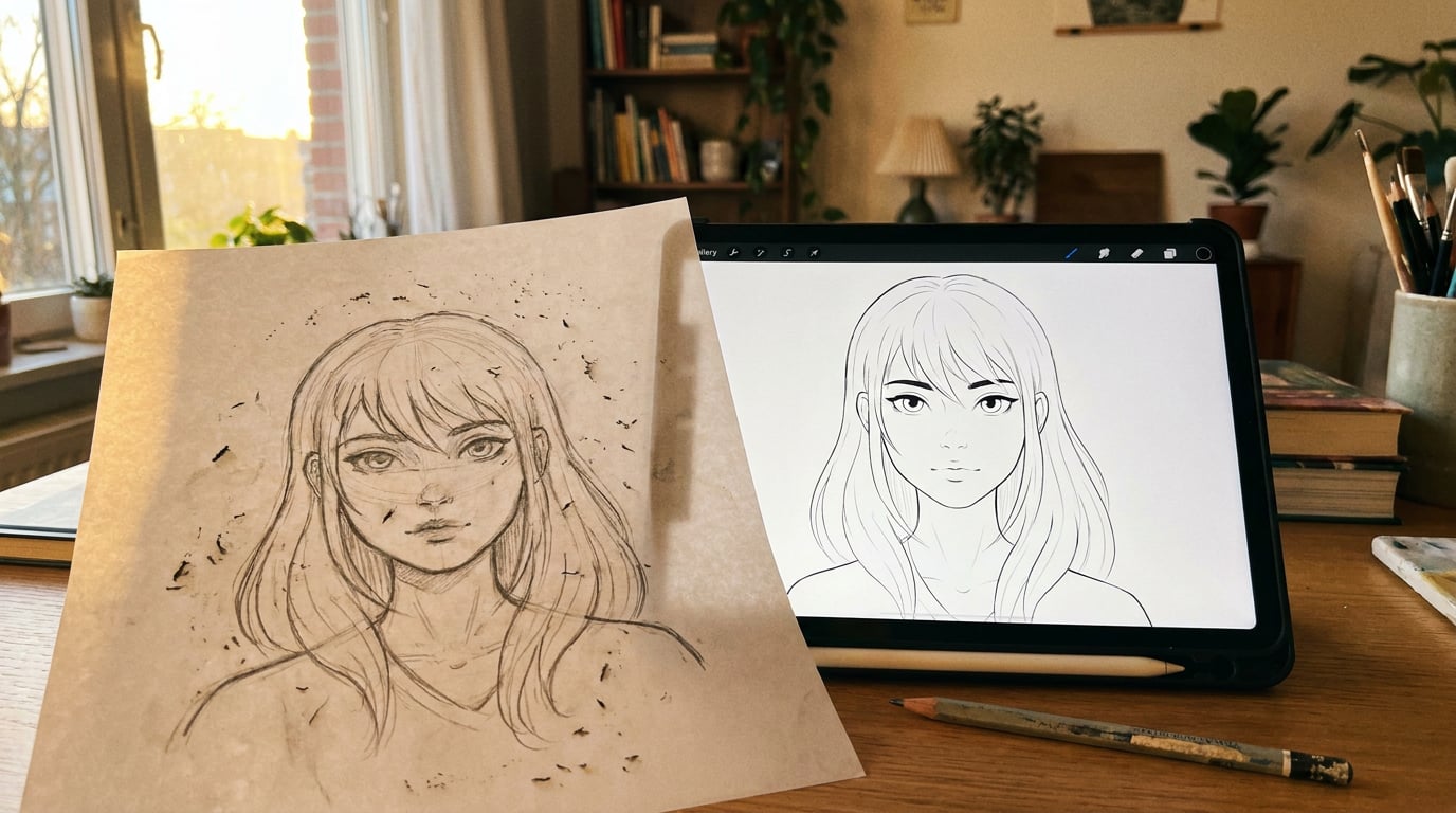
How to Prompt AI for Materials and Textures: Surface by Surface.

Vague texture prompts produce muddy results. This guide breaks down exactly how to describe surfaces, from brushed metal to raw concrete, across disciplines.
Why Texture Prompts Fail (and What They're Missing)

Naming a material is not the same as describing it. "Leather sofa" tells an AI model what the object is. It tells it almost nothing about how light should behave, how tight or open the grain is, or whether this is a factory-fresh cushion or a worn armchair that has spent a decade in a sunlit room. That gap between naming and describing is why so many generated textures come back flat, unconvincing, or generic.
Good texture prompts work on four layers: material type, finish state, light behaviour, and scale or context. Strip any one of them and the model is forced to guess. Most bad prompts are missing at least two.
Compare these two:
- Weak: "leather sofa"
- Strong: "aged full-grain leather, deep burgundy, visible pore structure, slight sheen at the seams where handling has burnished the surface"
The second prompt doesn't just name the material. It specifies grain type (full-grain), finish state (aged, burnished at seams), colour, surface topography (visible pore structure), and light response (slight sheen). Every word is doing work.
The same logic applies whether you are generating a concept render for a furniture client, retexturing a game character's costume, or creating a mockup for a packaging brief. The material has to read correctly, and that means giving the model enough physics to work with.
Finish state matters because it changes reflectance fundamentally. A polished surface concentrates reflections into sharp highlights. A brushed surface scatters them into elongated streaks. A matte surface diffuses them across the whole face. These are not stylistic choices you layer on top of a base material: they are properties that define the material under a specific light source.
Scale and context are equally critical. A prompt for "granite" read at kitchen countertop distance shows visible crystal clusters and veining. The same material described for a building facade seen from 10 metres needs aggregate scale, not mineral detail. AI texture tools like those used in 3D pipelines try to infer a full material system from your language, which means a vague prompt is not just unhelpful, it is actively ambiguous. Some tools return up to four seamlessly tileable textures from a single text prompt, with the model determining grain size, repeat frequency, and surface relief from context alone. Be specific and the model has something to work with. Be vague and it guesses.
On Stensyl's Image surface, which gives access to more than 20 generation models, prompt style should adapt slightly depending on your target model. Photorealistic models reward precise physical language. Stylised models respond better to material mood and material category, with less emphasis on exact reflectance values. Knowing which you are using before you write the prompt saves credits and revision cycles.
Every strong texture prompt needs four layers: material type, finish state, light behaviour, and scale or context. Missing even one forces the model to guess, and it usually guesses wrong.
Hard Surfaces: Metal, Glass, and Ceramic

Hard surfaces are where finish vocabulary earns its keep. "Metal" covers a range of physical states so broad as to be almost meaningless in a prompt. Brushed, polished, anodised, oxidised, and powder-coated metals all have different reflectance characteristics, different grain structures, and different relationships with the light around them.
Metal
An automotive designer describing a door panel for a concept review needs different language than a product designer rendering a machined knob for a consumer electronics pitch. The door panel sits in outdoor daylight, with sky reflection, road bounce, and changing light angles. The knob sits under controlled studio lighting, and its value comes from showing precision at close range.
For the automotive render: "matte satin silver body panel, micro-brushed finish with no visible grain direction, diffuse sky reflection, slight warm reflection from road surface below."
For the product shot: "machined aluminium knob, concentric turned marks, polished lands between grooves, specular highlight grazing from a hard directional light at 45 degrees left."
The mistake most prompts make is stacking finish adjectives without anchoring them to a light source or environment. "Shiny brushed anodised silver" gives the model three finish states that partially contradict each other, with no light direction to resolve them. A brushed surface has directional specularity that only appears when light crosses the grain. Saying "brushed aluminium, soft linear grain running horizontally, specular highlights grazing from the left" gives the model a consistent physical description to render from.
Glass
Glass prompts need four elements: clarity level, tint, surface treatment, and context. A web and UX designer mocking up a frosted glass UI card needs "lightly frosted tempered glass, high internal diffusion, slight blue-grey tint, clean surface, backlit by a soft white panel." An interior designer rendering a bathroom shower screen might need "acid-etched glass, uniform fine texture, no tint, lit from the side with warm ambient fill." The same word "glass" produces wildly different outputs depending on these variables.
Ceramic and Porcelain
For an interior design tile render: "matte unglazed stoneware, warm off-white, fine grog texture, slight variation in surface tone between tiles, lit by diffuse overcast daylight."
For a product design tableware shot: "high-gloss white porcelain, mirror-clean glaze, tight specular highlight at the rim, photographed on a white sweep with soft top light."
For an exhibition display prop: "crackle-glaze ceramic vase, ivory ground with fine dark crazing lines, slightly irregular surface, lit by a warm spot from above at a raking angle to emphasise surface relief."
In each case, the ceramic itself is almost incidental. What defines the prompt is the finish state, the light environment, and the viewing context. Get those right and the material follows.
Stacking finish adjectives without a light direction flattens depth. Anchor every finish descriptor to a specific light source or environment, and the surface becomes readable.
Soft and Organic Surfaces: Fabric, Leather, Wood, and Stone
Organic surfaces have more variables than hard surfaces, and those variables interact more. A fabric's weight affects its drape, which affects which faces catch light and which fall into shadow. Leather's grain type determines how it responds to handling over time. Wood's cut determines how grain runs across the face, which defines the whole visual character of the piece. These are not decorative details: they are the surface's physics.
Fabric
A game asset artist building a character costume cannot just write "linen." The model needs structure. "Heavy woven linen, tight basket weave, sun-bleached pale straw colour, rigid drape, surface fibres slightly raised, soft directional light from the upper left." That prompt describes weave structure, weight, colour history, drape behaviour, and lighting in one sequence. It gives the AI model enough to construct a believable textile rather than a smooth, slightly beige surface.
For a motion design background with draped fabric behind a product: "natural undyed cotton canvas, loose plain weave, soft drape with relaxed folds, lit by diffuse bounced light from the right, slight warm tone from ambient fill."
Leather
Grain type, treatment stage, and use context are the three axes that distinguish leather prompts. Full-grain, suede, nubuck, and patent all have different surface topographies and reflectance behaviours.
An automotive interior designer describing a seat bolster needs: "full-grain black leather, tight natural grain, gloss finish on the face, slight specular highlight at the crown of the bolster from a cabin overhead light, stitching recesses catching shadow." A fashion accessory render needs: "vegetable-tanned natural leather, open pore structure, burnished edges, handled and slightly darkened at contact points." The same material category, entirely different surface language.
Wood
Species, cut, finish, and age marker turn a generic wood prompt into a usable one. Quarter-sawn oak shows tight, straight grain with medullary ray flecks. End-grain shows a circular cellular structure. Book-matched veneer shows a mirror symmetry in grain pattern. Each cut reads completely differently even on the same species.
Add finish state and age: "quarter-sawn white oak, raw and lightly sanded, pale honey tone, fine straight grain, lit by a raking window light from the right to emphasise surface texture" versus "reclaimed pine floorboard, heavy wear, grey patina on high spots, nail holes visible, aggregate grain softened with age." Both are wood. Neither would produce the same result as the other, or as the word "wood" alone.
Stone and Concrete
An interior designer rendering a Calacatta marble countertop needs: "polished Calacatta marble, white ground with bold grey and warm gold veining, mirror-polished surface, sharp specular highlight from an overhead strip light, photographed at counter height." A set designer describing a brutalist concrete wall for a film location board needs: "rough-cast in-situ concrete, board-marked formwork texture, cold grey with slight aggregates visible, surface stained from water runs, lit by flat overcast daylight."
The scale cue matters here. For close-range surfaces, specify detail at viewing distance: "pore structure visible at 30cm." For architectural or set surfaces seen from distance: "aggregate visible from 3 metres, surface texture reads as monolithic." This helps the model determine grain size and level of detail, which directly affects how useful the output is for your actual application.
Scale is the most overlooked variable in texture prompting. Specifying viewing distance, not just material type, tells the model which level of detail to render, and that single change can transform an unusable output into a usable one.
Layered and Composite Surfaces: Paint, Coatings, and Wear

Paint and coatings are not surfaces in isolation. They are systems: substrate, primer, base coat, clear coat, and any effect layer between them. Prompts that skip the substrate and the coat stack tend to produce flat, uniformly coloured surfaces with no depth.
Paint and Coatings
For a product designer rendering a consumer electronics enclosure: "injection-moulded ABS body, soft-touch matte black paint, slight micro-texture visible at close range, no specular highlight, camera-side lit by diffuse light." For an automotive concept board: "body panel in candy red, deep metallic flake in base coat, high-gloss clear coat with strong specular reflection, lit by a hard overhead studio spot with soft fill from the sides." The substrate, the coat type, and the effect layer each contribute to the final read.
Graphic designers working on brand mockups often need surface context rather than the material itself. "Uncoated recycled board, natural cream-white, slightly absorbent surface, printed logo appears with slight ink spread on fibres" tells the model about the printing substrate, which is the surface the viewer actually sees. "Gloss laminate on rigid board, mirror surface, sharp reflections of overhead light, clean ink colours" is an entirely different substrate reading.
Wear and Patina
Wear prompts work best when they use sequential material history language rather than a single adjective like "worn" or "rusty." The sequence gives the model a cause-and-effect chain to follow, which produces plausible surface variation rather than a uniformly degraded texture.
"Chrome plating worn through to brass at contact edges, verdigris forming in recesses, base metal polished bright on the highest-contact points" describes a specific material history. The chrome was applied over brass, wore first at the edges, and the brass underneath has oxidised in low-contact areas while remaining bright where hands have continued to polish it. That is a coherent surface story, and the model can render it because each stage has a logical spatial logic.
Material Age Prompting
One useful technique for pitches and client presentations is to prompt the same surface at three time stages: new, six months of use, and five years of use. This is not a guaranteed precise control mechanism, but it gives you a material story across time that is genuinely useful for communicating a product's life cycle or a set's narrative history to a client. An exhibition designer presenting a temporary stand concept might want to show how a brushed steel surface will look on opening day versus at the end of a three-week run, with foot traffic scuffs at base level and fingerprints on touch points.
| Surface | New | 6 Months Use | 5 Years Use |
|---|---|---|---|
| Brushed steel panel | Uniform linear grain, no marks, cool neutral tone | Light scuffs crossing grain direction, slight dulling at contact points | Deep cross-grain scratches, oil staining at handling zones, warm patina on high spots |
| Natural oak tabletop | Raw sanded, pale honey, tight grain, no finish | Lightly oiled, slight darkening, first ring marks visible | Deep amber tone, grain filled, nicks at edges, worn pale on highest-use zone |
| Full-grain leather | Natural tan, open pore, slight stiffness in drape | Darkened at contact edges, small creases forming at flex points | Deep patina, burnished high spots, prominent crease lines, softened drape |
Putting It Together: Multi-Surface Scene Prompts
When a scene contains multiple surfaces, hierarchy is everything. The model needs to know which surface is dominant before it can calibrate the secondary materials against it. Describe the primary surface first, establish its finish and light behaviour, then layer in secondary surfaces and accent details in descending order of visual weight.
A motion design background render with a brushed steel table, linen backdrop, and ceramic props needs a clear material stack: "brushed steel table surface, horizontal linear grain, soft specular highlight from a diffuse strip light above; backdrop of natural undyed linen, loose weave, slight warm cream tone, in soft shadow; ceramic props in matte unglazed stoneware, warm grey, catching edge light from the right."
The lighting environment is the multiplier. The same brushed steel reads cold and clinical under diffuse overhead fluorescent light, warm and filmic under a low raking tungsten source, and dramatic under hard backlight with the grain catching as a bright edge line. Naming the light environment in the prompt aligns all the surface descriptions to a single physical context, which is what gives a multi-surface scene coherence.
A Complete Worked Example: Product Hero Shot
Consider a consumer electronics device on a stone surface with a fabric background. Here is a fully annotated multi-surface prompt:
"Consumer electronics device in soft-touch matte black ABS, slight micro-texture visible on the casing [material type + finish state], no specular highlight on the body face, thin gloss border catching a faint rim light from the right [light behaviour per surface zone]; surface below is honed grey soapstone, matte with subtle veining, cool tone, slight warmth from a bounce card below frame [secondary surface]; background is heavy charcoal grey wool felt, tight compressed surface, in shadow and out of focus [accent surface + spatial context]; lit by a large softbox at 45 degrees left, small fill card at camera-right, no hard shadows."
Each surface has its own finish state and light behaviour. The hierarchy is clear: device first, stone second, felt last. The light environment is specified, so every surface description is anchored to the same physics.
Using Ray and Boards in This Workflow
Before committing credits on a complex multi-surface prompt, use Stensyl's Ray assistant to sense-check the language. Ray can suggest more precise material terminology when a descriptor is ambiguous, flag when a combination of surface properties is likely to produce a flat or contradictory result, and recommend which image model on the platform suits your specific surface type and output goal. If you are working with an unfamiliar material category, for instance a specific industrial coating or a heritage material, Ray's web search capability means it can pull current reference before you write a word.
Boards is the right place to collect real surface references before prompting. Grouping actual material swatches, product photography, and environmental references in a Boards canvas gives you a comparison benchmark when reviewing generated outputs. It also sharpens your own language: when you have been looking at real brushed aluminium for five minutes, you write a much better prompt than when you are working from memory alone.
Model Selection for Texture Work on Stensyl
Not all image generation models on Stensyl handle surface detail the same way. Some excel at photorealistic micro-texture, which makes them well-suited to product renders and automotive concept work where surface fidelity is the whole point. Others prioritise compositional clarity over fine surface detail, which is often exactly right for motion design backgrounds or graphic design mockups where the texture serves the composition rather than being its subject. The practical approach is to match your model choice to your output goal, not just to pick whichever model produced good results last time.
3D Asset Workflows
For game development and product design work involving existing 3D geometry, Stensyl's 3D studio offers a retexture function that is more efficient than image generation for applying surface treatments to models in GLB, FBX, or OBJ format. Prompting a retexture pass on an existing model uses different language from composing a hero image: you are describing the material system to be applied to known geometry, not directing a composition from scratch. Prompts here should focus on material type, finish state, and any material history (wear, patina, treatment stage), rather than including lighting direction or camera angle, which are controlled by the scene setup rather than the texture itself.
Scene Composer, Stensyl's 3D scene composition surface, lets you apply generated textures to posed 3D models and render to a photorealistic image. This is the most controlled workflow for product designers and interior designers who need both surface accuracy and spatial context. You are not guessing how a texture will read in a scene: you can place it, light it, and render it with the geometry holding the spatial relationships.
Credit Efficiency
A practical workflow for any paid plan on Stensyl is to draft texture concepts using a faster model first. Confirm that your prompt language is producing the right surface character, grain scale, and finish state before switching to a higher-fidelity model for final output. The credit difference between a fast draft run and a high-fidelity final render is significant, and the draft pass often reveals prompt gaps that would have been expensive to discover on the final model. This approach works on any paid tier: Lite, Starter, Pro, or Studio. The credit system is designed to support iteration.
Ray can tell you which image model on the platform is best suited to a specific surface type and output goal before you spend a credit. That removes the guesswork from model selection, particularly when working with unfamiliar materials or attempting a surface category you have not prompted before.
Draft your texture prompts on a fast model first to confirm the surface language is working, then switch to a higher-fidelity model for finals. This single workflow habit will save more credits than any other optimisation.
Surface prompting is a learnable skill that compounds. The four layers, material type, finish state, light behaviour, and scale or context, apply to every surface in every discipline, from an automotive paint finish to a printed exhibition graphic to a game environment floor tile. Build the habit of working through all four before you generate, use Ray to pressure-test the language, and collect real material references in Boards before you start. The gap between a flat result and a convincing surface is almost always in the prompt, not in the model.
```Keep reading.

Try Stensyl for yourself
Image, video, 3D, chat, and document drafting. Every AI model, one studio. Plans from $11/month.