From Wireframe to High-Fidelity Mockup: AI Workflows for UI/UX Designers.
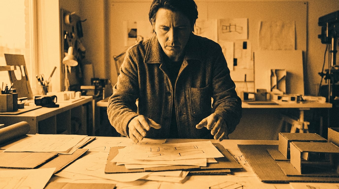
AI can close the gap between a rough wireframe and a polished mockup in hours. Here's how UI/UX designers are building that workflow today.
Where the Wireframe-to-Mockup Gap Actually Costs You Time
The jump from a validated wireframe to a client-ready high-fidelity mockup is not a design problem. The design decisions are largely made. What slows you down is production: filling in copy placeholders, sourcing visual assets, and polishing layouts to a standard that holds up in a stakeholder meeting. These are execution tasks, and they are where most of the time goes.
Three stall points appear consistently in UX workflows. The first is placeholder copy. Lorem ipsum works fine at the wireframe stage, but the moment real words land in a mockup, stakeholders start reacting to content rather than structure. Getting that copy right before the first hi-fi review requires a separate effort that most teams schedule too late. The second stall point is visual asset sourcing: the back-and-forth between Figma, stock libraries, icon packs, and external illustrators fragments the workflow and introduces revision loops that have nothing to do with UX quality. The third is client-facing polish pressure, the expectation that a hi-fi mockup looks production-ready before the design system is even finalised.
AI targets all three. Tools like Uizard, Visily, and Figma Make have positioned their value explicitly around compressing these production steps, not replacing the underlying UX thinking. Uizard's Autodesigner generates multi-screen low-fidelity flows from a natural-language prompt; its Wireframe Scanner converts a hand-drawn sketch into an editable hi-fi UI. Figma Make markets the ability to go "from words to interactive layouts without coding or extra tools." These tools automate execution. They do not decide information architecture, content hierarchy, or interaction logic. That remains your job.
The same logic applies inside Stensyl. Each surface in the platform maps to a specific production stage in the wireframe-to-mockup pipeline: research and visual language before frames are drawn, asset and copy generation during production, and layout assembly and sharing at the presentation stage. What follows is a practical walkthrough of how that maps to a real UX workflow.
The wireframe-to-mockup gap is a production problem, not a design problem. AI eliminates the repetitive execution steps between a validated UX decision and a client-ready visual.
Building Your Visual Language Before You Touch a Frame

Mockup pivots are expensive. When a client rejects a visual direction mid-sprint because the colour palette "feels wrong" or the typography "doesn't match the brand," the problem usually traces back to a visual language that was never properly established before production started. Front-loading visual decisions is the single most reliable way to reduce mid-mockup iteration.
Stensyl's Moodboards surface is built for exactly this stage. Before opening a design file, use it to gather UI reference imagery, establish colour palette direction, and define typographic tone. The moodboard becomes a shared reference point for every asset and copy decision that follows: a constraint that keeps the mockup coherent rather than assembled.
Using Research to anchor platform and accessibility standards
Alongside visual references, most mockups need to satisfy platform-specific requirements: Apple Human Interface Guidelines, Material Design 3, WCAG accessibility standards, or a client's existing design system. Pulling these manually from documentation tabs, PDFs, and bookmarks adds friction that compounds across a project. Stensyl's Research surface, backed by Perplexity, lets you retrieve competitor UI patterns, HIG snippets, and accessibility colour contrast ratios without leaving the workflow. The large-context models available in Write (covered in section 4) can then hold that research alongside your draft copy without losing context mid-task.
Fintech app redesign: locking visual language first
Consider a mobile banking app redesign. The temptation is to open Figma and start with the dashboard screen. A better approach: spend thirty minutes in Stensyl Moodboards pulling reference from Revolut, Monzo, and Coinbase's current UI, noting their card component styles, data visualisation palettes, and empty-state treatments. Use the Research surface to pull WCAG AA contrast ratios for the proposed colour direction. Only then move to wireframes. When the mockup stage arrives, the palette is fixed, the typographic hierarchy is defined, and the asset brief for illustrations and icons is already implicit in the reference board. Mid-sprint pivots become edge cases rather than the norm.
This workflow is not unique to fintech. Automotive HMI teams collect screenshots from Tesla, Porsche, and BYD, then use moodboards to explore iconography and light/dark theme directions before committing to embedded HMI tools. Game UI teams gather reference from Overwatch, Valorant, and Destiny to establish the visual register for HUD elements and menus. The discipline changes; the principle does not.
Front-loading visual decisions in Moodboards and Research reduces mid-mockup pivots. Most wasted revision time traces back to a visual language that was never agreed before production started.
Generating UI Assets and Imagery at Mockup Speed

With a visual language established, asset production is where AI delivers its most visible time saving. The traditional route, licensing stock photography, commissioning illustrations, sourcing icon packs, and waiting on specialist handoffs, introduces delays that are entirely decoupled from UX quality. A mockup does not become more usable because an illustrator took two weeks to deliver consistent onboarding screens.
Generate: photography, illustration, and UI imagery
Stensyl's Generate surface covers image, video, audio, and 3D generation. For mockup production, the most relevant use cases are hero imagery, placeholder photography that matches the product's demographic and tone, UI illustration assets for onboarding screens and empty states, and icon-style graphics. The key to asset sets that feel designed rather than assembled is consistent prompting: reference the same palette, typographic tone, and mood description established in your moodboard at every generation step. Running multiple Generate outputs and selecting the strongest three is faster than a single round of revisions with a stock library, and it keeps creative control with the designer rather than delegating it to a search algorithm.
Image models available through Generate, including Flux variants widely used for stylised UI art, produce results that can be iterated quickly within a session. Consistency comes from re-using moodboard references and descriptive style anchors in prompts; most models do not maintain a shared project palette automatically across sessions, so the discipline of consistent prompting matters.
Graphics: vector elements and custom icon sets
For vector-style UI elements, Stensyl's Graphics surface handles badges, decorative backgrounds, brand marks, and custom icon sets that would otherwise require a motion to a specialist. A set of eight pictogram-style icons for a mobile navigation bar, a decorative background pattern for a web landing section, a set of status badges for a SaaS dashboard: these are the kinds of small but time-consuming assets that accumulate into real delays across a sprint. Graphics generates them in the same session as the broader asset work.
Practical example: onboarding illustrations for a mobile app
A meditation app redesign typically requires four to six onboarding screen illustrations: calm, human, tonally consistent with the app's colour system. Commissioning these individually, even at a fast turnaround, introduces revision loops across multiple weeks. Generating a coherent set in a single Stensyl session, using the moodboard palette as a style anchor, compresses that to an afternoon. The outputs may require editing refinement, and Stensyl's Editing surface handles frame-level adjustments, but the starting point is already inside the visual language rather than outside it.
The same approach applies to exhibition touchscreen kiosks, where custom pictogram sets need to feel thematically matched to the exhibit (a science museum and an art biennale have very different registers), and to film and set design workflows, where control-panel visuals and faux "system UIs" need to match a production's visual language without the budget for custom design work.
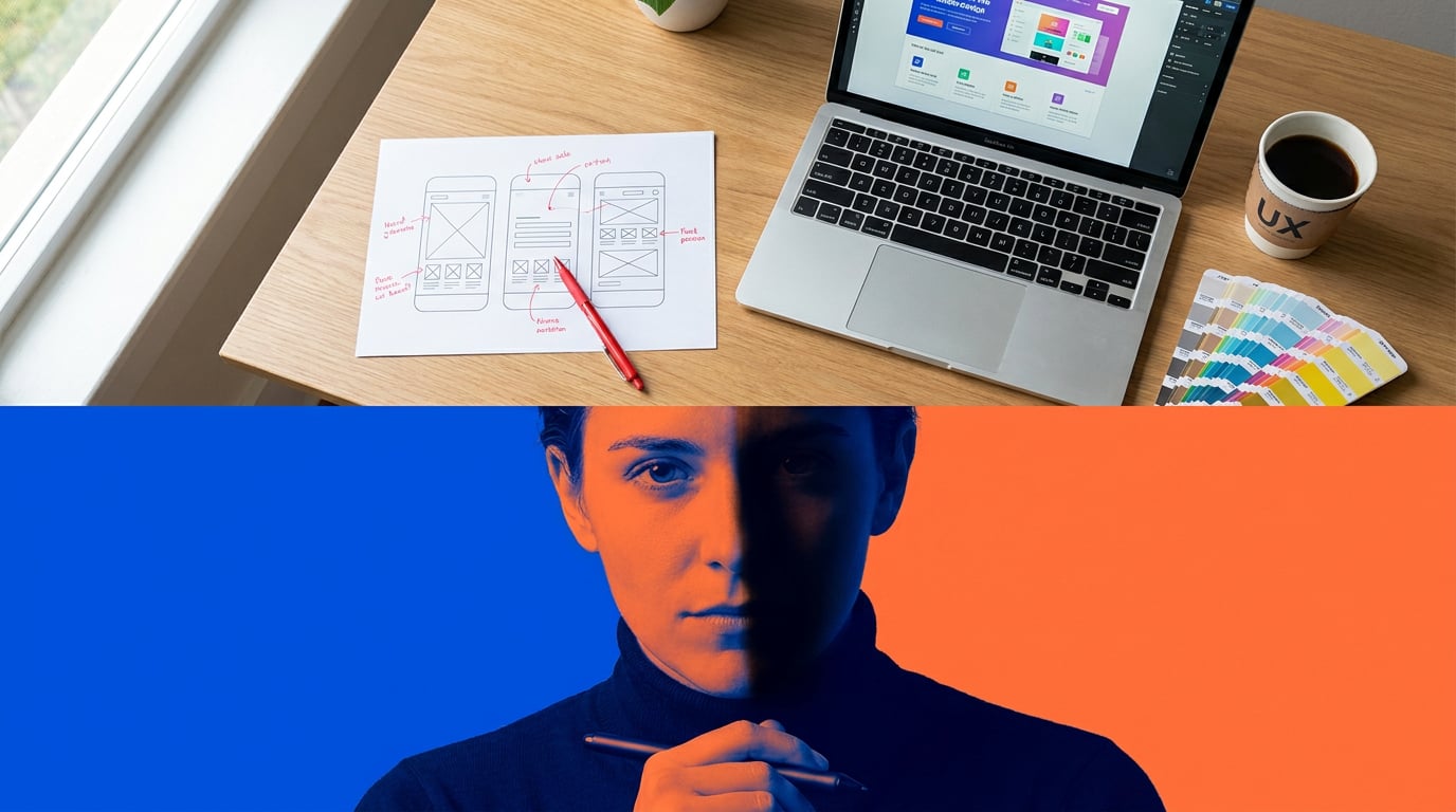
Writing UI Copy and Microcopy That Fits the Design
Wireframes ship with lorem ipsum. High-fidelity mockups need real words, and real words take time to write well. Button labels, empty-state messages, error copy, onboarding flows, tooltip text: each requires a different register, a different length constraint, and a different understanding of what the user is trying to do at that moment. UX Writing Hub and Nielsen Norman Group both identify copy as a top source of late-stage iteration precisely because stakeholders react to real language in a way they never react to placeholder text. Getting copy into mockups early, even as a working draft, reduces that problem significantly.
Choosing the right model for the task
Stensyl's Write surface offers a multi-model picker that lets you match the model to the copy task. The choice matters: a lightweight model that produces fast microcopy variants is not the right tool for a 600-word onboarding flow, and an expensive high-capability model is unnecessary for generating twenty button label options.
| Copy task | Recommended model | Tier required |
|---|---|---|
| Button labels, short variants (bulk) | Gemini Flash | Lite |
| Error messages, empty states (variants) | GPT-5.4 mini | Lite |
| Onboarding flows, marketing copy within app | GPT-5.5 | Starter |
| Full UX narrative, complex error-recovery copy | Claude Sonnet 4.6 | Pro |
| Extended UX writing with nuanced tone | Claude Opus 4.7 | Pro |
Gemini Flash and GPT-5.4 mini are fast and credit-efficient, well suited to generating large numbers of short variants that will be screened manually. GPT-5.5 handles longer contextual UX writing where coherence across a flow matters. Claude Sonnet 4.6 and Opus 4.7 bring stronger tone control for nuanced copy work, error-recovery explanations in regulated domains, and situations where the voice needs to be consistent across a long document.
Practical example: error messages for a checkout flow
Generating twelve error message variants for a checkout flow takes under ten minutes with any current LLM. The time is dominated by human review, not generation. A single prompt specifying the error condition, the user's likely emotional state, the tone of voice, and the character limit produces variants across a range of approaches: directive, reassuring, technical, conversational. Selecting the best three for the mockup becomes a curatorial decision rather than a writing task. For a fintech or health product, those three still route through legal and compliance review; AI accelerates drafting, not approval.
Using Ray when the task is ambiguous
When the copy task does not fit neatly into a model choice, Ray, Stensyl's creative-decision assistant, gives a fast recommendation. Ray is locked to a fast Anthropic Haiku model and is built to help you pick the right surface or model for a task rather than to produce the output itself. If you are not sure whether a particular piece of UX writing needs Gemini Flash's speed or Claude Sonnet's tone control, Ray gives you a steer in seconds.
Copy is the most common cause of late-stage mockup iteration. Getting real words into frames early, using the right model for the task, reduces stakeholder reaction time and shortens the approval cycle.
Pulling It Together: Presenting the Mockup with Confidence
Assets generated, copy drafted, visual language established: the final stage is composing and presenting the mockup. This is where workflow fragmentation is most painful. Moving approved assets from a generation tool into Figma, importing copy from a document, re-uploading reference images, and then exporting everything to a PDF or a prototype link: each step introduces a version-control risk and consumes time that contributes nothing to the quality of the design.
Canvas: chaining generation steps into a layout pipeline
Stensyl's Canvas is a node-based workflow editor that lets you chain generation steps without re-uploading between tools. An Image Generate node feeds approved asset outputs into an LLM Chat node for copy annotation; a Graphics node delivers icon sets into the same workspace. The LLM Chat node in Canvas uses the same multi-model picker as Write, so model selection is consistent across the workflow. For a SaaS dashboard redesign, this means the full production pipeline, hero imagery, chart illustrations, tooltip copy, empty-state messages, and badge graphics, runs inside a single Canvas project without file exports between stages.
Web: sharing interactive previews without PDF bottlenecks
Client review via PDF deck is a workflow tax. Stakeholders comment on static images rather than interacting with layouts; feedback is less specific and harder to action. Stensyl's Web surface generates lightweight interactive previews and microsites that can be shared as a link. For a marketing agency presenting a speculative SaaS UI to a prospective client, or an exhibition designer seeking curatorial approval on a kiosk concept, a shareable microsite closes the feedback loop faster than a slide deck.
Projects: keeping assets versioned across the mockup process
Stensyl's Projects surface acts as the organisational layer across the entire pipeline. Brand identity files, moodboard references, approved asset outputs, and copy documents are stored in a shared workspace that the team accesses without re-uploading. For agencies running multiple mockup sprints in parallel, this prevents the asset versioning chaos that typically emerges when five people are generating, editing, and presenting simultaneously.
Choosing the right tier for mockup work
Credit consumption across a full wireframe-to-mockup sprint covers Research queries, Generate outputs, Graphics assets, Write sessions, Canvas workflow runs, and Web publishing. Solo UX practitioners running one sprint at a time will find the Pro tier (£42/mo, 6,000 credits, 2 concurrent generations) covers the pipeline without overhead. Agencies running multiple mockup sprints in parallel, where four concurrent generation jobs are running across different projects, are better served by the Studio tier (£84/mo, 12,500 credits, 4 concurrent generations). The credit economy reflects the actual shape of the work: more parallel workstreams need more simultaneous capacity, not just more total credits.
The wireframe-to-mockup pipeline has never been a design problem. It has always been a production problem: copy that arrives late, assets that come from the wrong place, polish that takes longer than the design itself. Addressing each stall point with the right tool, in a single workflow rather than five separate subscriptions, is where the real time saving lives.
A B2B SaaS redesign that runs the full Stensyl pipeline, moodboard research, asset generation, copy drafting, Canvas assembly, and Web preview, delivers a client-facing hi-fi mockup in a fraction of the time a fragmented toolchain requires. The design decisions are still yours. What changes is how long it takes to make them visible.
```Keep reading.


Try Stensyl for yourself
Image, video, 3D, chat, and document drafting. Every AI model, one studio. Plans from $11/month.