AI Moodboard to Brand Kit: Build a Visual Identity in Stensyl.
Chain Stensyl's surfaces together to take a visual direction from raw references all the way to a deployable brand kit, without switching apps.
Why Most Visual Identity Projects Stall Before They Start

The visual identity process breaks most often in the middle: after the references are collected, before the first asset is made. A graphic designer spends hours pinning images, building a moodboard in one tool, then opens a separate generation platform and loses the thread entirely. The colour temperature of that hospitality shoot, the weight of that typeface specimen, the texture logic they had almost articulated — gone, because the tools don't share context.
This is not a niche frustration. It affects every discipline that builds visual systems. A product designer assembling a range identity for packaging collateral. A game developer establishing the UI visual language for a new title. A marketing team trying to lock in a campaign look before briefing social and advertising assets. In every case, the moodboard and the generation tool are separate windows, separate logins, and effectively separate mental models.
The market has begun responding to this. Platforms like Blaze scan a client's website, pull visual and text characteristics, and assemble colour, logo, and font data into a kit before any design work begins. ImagineArt's brand kit generator takes a prompt that includes target mock-up items and returns a coherent starting set. Adobe Express positions its brand kit as a shared team asset. The pattern is consistent: the industry is moving towards systems that start with references and end with editable, shareable brand kits rather than isolated outputs.
Stensyl's surface chain makes the same journey possible without jumping between platforms. The workflow runs from Boards through Research and Write into Image, Graphics, and Canvas, and lands in Projects as a shareable kit. What follows is a step-by-step guide through each stage.
The finished output of this workflow is specific and practical: a colour palette, a type direction, logo mark options, graphic elements, a written brand brief, and a reusable Canvas workflow — all traceable back to the original references. Nothing is invented mid-stream. Everything earns its place by connecting back to what the moodboard said first.
The biggest cost in visual identity work isn't generation time. It's the context lost every time you switch tools between inspiration and output.
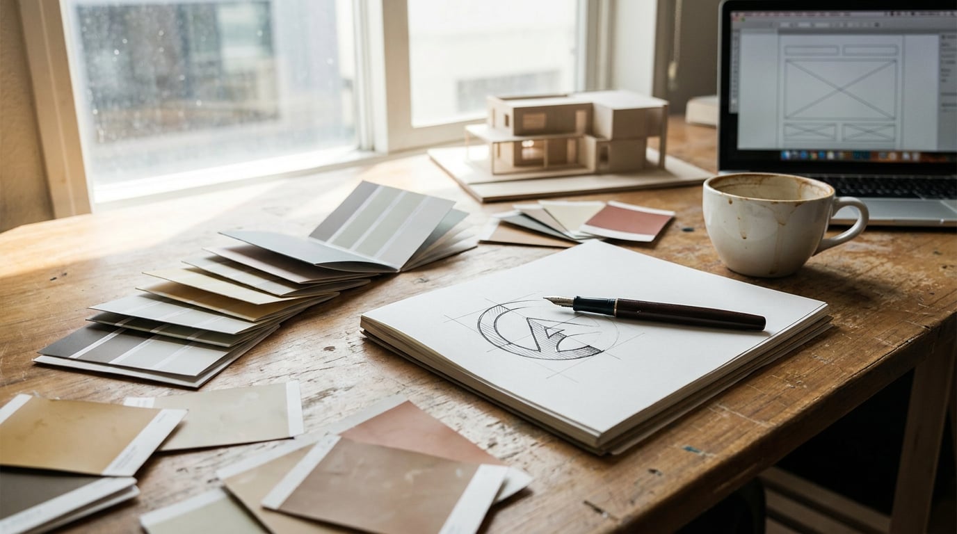
Step 1: Build and Curate Your Reference Moodboard in Boards

Open Boards at /boards and create a new board for the project. This is a fluid canvas: drag in images, upload screenshots, pull in saved assets, and let the material accumulate without imposing structure too early. The goal in this first pass is density, not organisation.
Once you have a working mass of references, use grouping to impose order by theme rather than by file type. Separate references into clusters: one for colour family, one for texture weight, one for mood or atmosphere. A hospitality interior designer, for example, might group material swatches and surface photography together, separate from lighting references that define the ambient quality they're chasing, and separate again from spatial compositions that establish proportion and scale. Three distinct clusters, each making a different argument about the brand's visual logic.
The value of a dense, grouped Boards canvas is pattern recognition. When you stand back from a well-organised moodboard, recurring palettes become visible. If warm ochres keep appearing across unrelated references, that's not coincidence. If every image in the texture cluster has high surface grain, that texture weight is a real directive, not a stylistic preference. Boards makes this visible before a single prompt is written.
Boards also supports first- and last-frame scene grouping for video generation, but in an identity workflow, keep this stage focused on static reference curation. The job here is building the visual argument that every subsequent step will serve.
A moodboard that isn't organised is just a folder. The grouping step in Boards is where references become a brief.
Step 2: Use Ray and Research to Sharpen the Brief
With the moodboard grouped and the visual patterns visible, open Ray at /ray. Describe the brand's audience, its sector, and the mood you identified from the Boards canvas. Ray is a creative-decision assistant built to help you choose the right generation models and surfaces for a given task. At this stage, use it to sense-check your visual direction and get a clear recommendation on which surfaces will serve the identity work best.
Then move to Research at /research. This is a Perplexity-backed surface, built for grounding creative decisions in real-world context. Use it to audit sector visual conventions, map competitor colour usage, and surface any cultural colour associations relevant to the target market. A motion designer building a visual identity for a broadcast series, for instance, would use Research to review title-card design conventions across comparable shows before defining what the new brand needs to depart from. You can't make a deliberate break from convention if you haven't documented the convention first.
Feed the Research output into Write at /write to draft a short written brand brief. The multi-model picker in Write gives you six models to work with. For a longer, structured document, Claude Sonnet 4.6 or GPT-5.5 are well-suited: Sonnet 4.6 handles nuanced tonal direction, while GPT-5.5 produces flexible structured output that's easy to iterate on. Write the brief in two parts: a factual context section drawn from Research, and a creative direction section drawn from the Boards patterns.
This written brief is the most important document in the workflow. Every generation prompt in the steps that follow should be anchored to its language. Consistency across surfaces — across Image, Graphics, and Canvas — starts here, not in the individual prompt fields.
Research grounds the brief in sector reality. Without it, creative direction is just taste. With it, every generation decision has a defensible reason.
Step 3: Generate Colour, Type, and Graphic Elements

Take the written brief into Image at /generate/image. Use it to generate palette explorations and texture or pattern assets. The key discipline here is using the brief language verbatim in your prompts rather than paraphrasing. If the brief says "warm ochre and raw linen with high surface grain," that phrase goes directly into the prompt field. Deviation from brief language is where visual drift begins.
With 20-plus models available on the Image surface, run the same prompt across multiple models to compare aesthetic interpretations. The variation between models for an identical prompt is meaningful, not cosmetic. One model may render colour temperature warmer; another may handle texture with more grain. For an identity workflow, this variation is useful: you're not looking for one perfect image, you're mapping the aesthetic range that the brief supports.
For vector-ready graphic marks, logo concepts, and typographic lockup options, move to Graphics at /graphics. This is the right surface for identity elements that need to function at multiple scales and in multiple contexts. An automotive designer generating badge mark options for a sub-brand would use Graphics for the mark itself, then use Image to produce photorealistic context renders showing how the mark reads on a painted surface or a vehicle door card. The surfaces do different things; using both in sequence gives you both the asset and the proof of context.
As you generate, save assets back into the originating Boards project. Keep the visual thread intact: references in one group, generated palette explorations in a second, mark concepts in a third. The Boards canvas becomes the living record of the identity as it develops, not just the starting point.
| Surface | Best used for | Identity workflow application |
|---|---|---|
| Image (/generate/image) | Photorealistic and stylised image generation across 20+ models | Palette explorations, texture assets, context renders |
| Graphics (/graphics) | Vector and graphic design generation | Logo marks, typographic lockups, graphic elements |
| Boards (/boards) | Fluid reference canvas with grouping | Storing and organising all generated assets alongside references |
Step 4: Chain Everything in Canvas for a Repeatable System
Individual generation sessions produce assets. A Canvas workflow produces a system. Open Canvas at /canvas and build a node-based workflow that connects an LLM Chat node to your Image Generate and Graphics nodes. The logic is straightforward: the brand brief lives in the LLM Chat node, and prompt variations for individual assets flow from that single source rather than being retyped per generation surface.
The LLM Chat node in Canvas uses the same six writing models available in Write. Choose based on the job at hand. Claude Opus 4.7 is well-suited to nuanced brand voice guidance and detailed tonal reasoning. Gemini Pro handles structured output reliably, which is useful when generating brief variants in a defined format. GPT-5.5 offers flexible iteration when you need to test multiple prompt directions quickly.
An exhibition designer building a spatial brand for a travelling stand, for example, could pipe a single brief through multiple Image Generate nodes to produce stand visuals in different colourway variants simultaneously. One Canvas session, one central prompt, multiple outputs that all share the same brief logic. That's the advantage of the node-based structure: it prevents the brief from fragmenting as the number of assets grows.
Use Canvas to stress-test the identity across contexts before the kit is finalised. Generate the brand mark on light backgrounds and dark backgrounds. Test graphic elements across product surfaces. Produce motion-ready still frames that show how the identity holds up at frame scale. Do all of this in one chained session so each test is drawing from the same brief source.
Once the workflow is set up and validated, save it as a reusable project template. The next client brief starts from the same node structure, with the brief content swapped out. Setup time collapses; process quality stays consistent.
The Canvas workflow is where an identity project stops being a collection of assets and becomes a repeatable system. Build it once, use it across every brand brief.
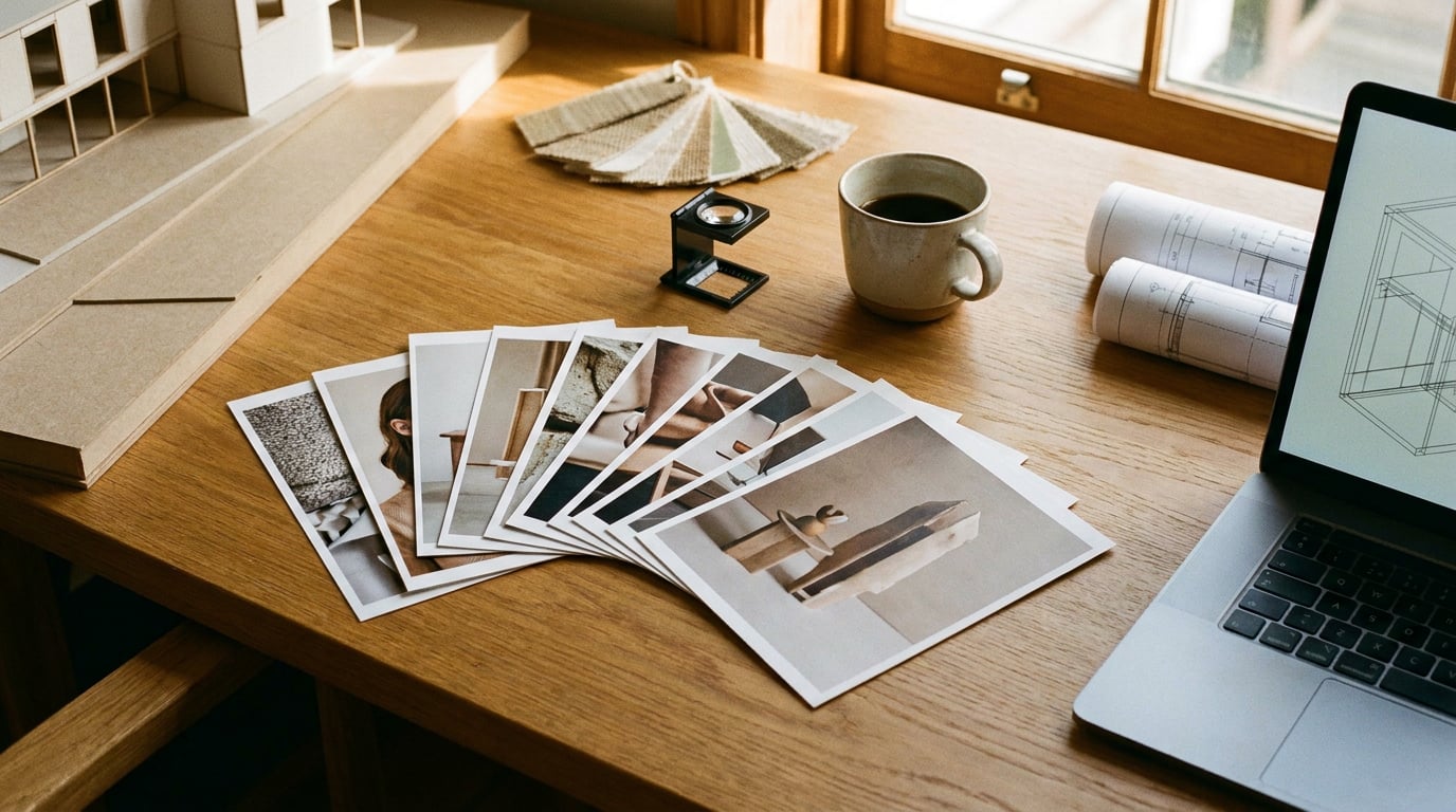
Step 5: Package the Brand Kit and Prepare for Handoff
Return to Boards and consolidate all approved assets into a formal brand reference frame. Organise it clearly: palette swatches in one group, approved mark variants in a second, type specimens in a third, graphic elements and texture assets in a fourth. This isn't aesthetic tidying. It's the structure that lets a marketing team, a content creator, or a packaging supplier navigate the kit without needing to interrogate the designer.
Return to Write to finalise the brand guidelines document. The multi-model picker makes this efficient. Use Gemini Flash for fast structural passes when you need to scaffold the document quickly. Switch to Claude Opus 4.7 for the sections that require refined brand voice copy: tone of voice direction, usage rules, the rationale for key creative decisions. Switching models mid-draft is built into the Write surface — there's no friction in using the best model for each section of the document rather than committing to one throughout.
For team handoff, use Projects at /projects to store the brand identity files, written guidelines, and Boards reference in a shared workspace. Stakeholders can access the full kit without needing to regenerate anything. The brief that anchored every generation decision is there. The moodboard that preceded it is there. The Canvas workflow that produced the assets is there. Nothing has to be explained from scratch because the context was never discarded.
Consider what this means at the point of handoff for a graphic designer handing a brand kit to a marketing team. The marketing team opens the project, finds the written brief alongside the approved assets, and can brief social and advertising work without a lengthy verbal debrief. The Boards references that defined the visual logic are visible. The decisions are legible. The brief for the next stage of work practically writes itself.
A brand kit that includes the references and the brief that generated it is worth more than one that delivers only the final assets. The context is what makes it reusable.
The full chain: Boards for reference collection and organisation. Ray for model and surface direction. Research for sector grounding. Write for the brief and final guidelines. Image and Graphics for asset generation. Canvas for a repeatable, brief-driven workflow. Projects for shared storage and handoff. No surface invented. No context lost between steps.
That continuity, from first reference image to final deliverable kit, is what separates a visual identity built in a connected system from one assembled across six separate tools. The work is the same. The loss between steps is not.
Keep reading.
Try Stensyl for yourself
Image, video, 3D, chat, and document drafting. Every AI model, one studio. Plans from $11/month.