Ideogram v3 for Architects: Site Plans, Diagrams, and Presentation Graphics.
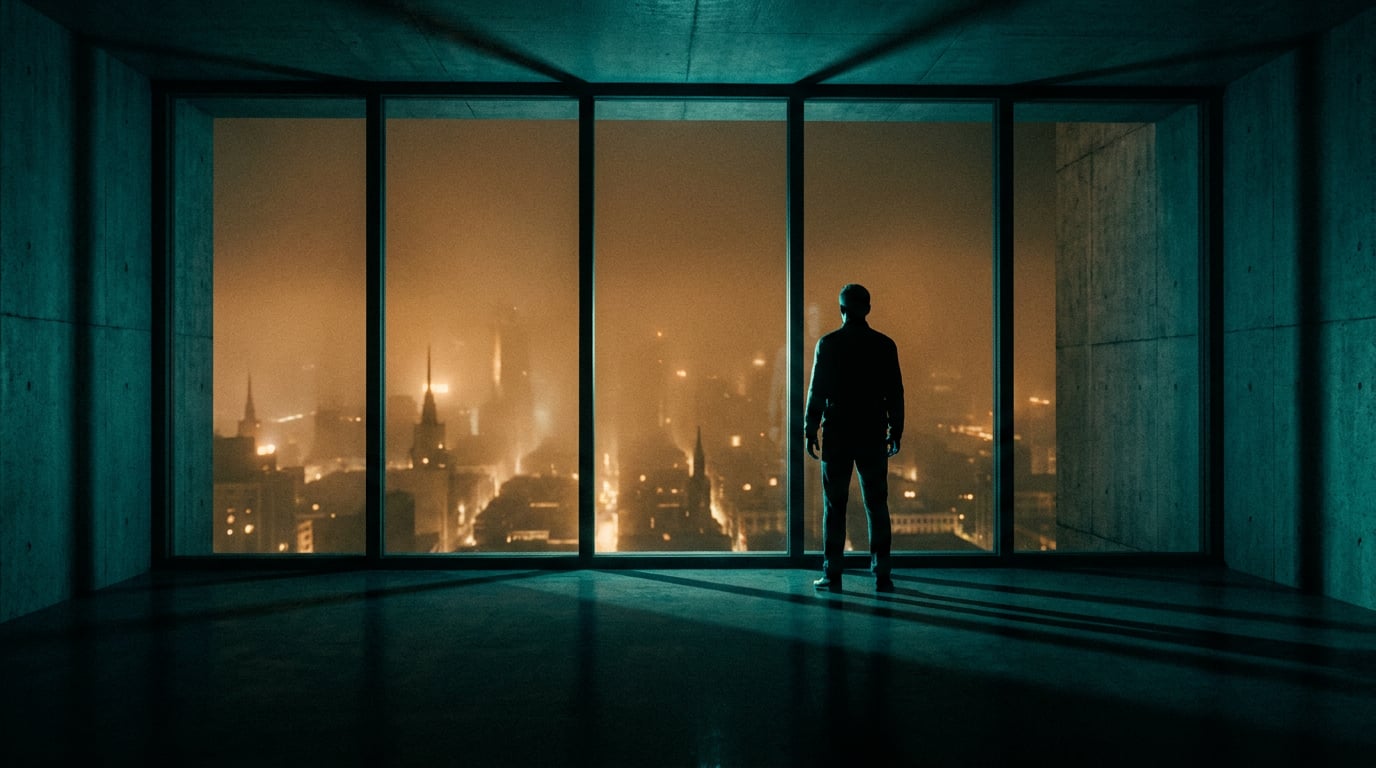
Ideogram v3 produces legible text inside generated images, making it one of the few AI image models worth serious attention for architectural graphics.
Why Legible Text Makes or Breaks Architectural AI Graphics

Most AI image models treat text as texture. Ask them to generate a labelled floor plan and you get something that looks like a drawing from a distance but dissolves into warped letterforms the moment a client leans in. That failure mode is specific and consistent across general-purpose generators, and it matters enormously in architecture.
Architectural graphics are not decorative. A site analysis diagram without legible compass orientation is misleading. A presentation cover where the project name renders as smeared glyphs is unpresentable. Room labels that morph between "Kitchen" and "Klitchan" require manual correction in Illustrator before the board goes to print. Every one of those corrections costs time that schematic design phases rarely have to spare.
Ideogram v3 is a text-to-image model whose central differentiator is its typography engine. Where general image models approximate letterforms as visual patterns, Ideogram v3 treats text and layout as structured design elements. Vendor materials describe the model as capable of "stylised, accurate text with remarkable precision, including complex and lengthy compositions," and third-party platforms including Recraft and Cliprise describe it as widely regarded as the leading model for text rendering inside images, particularly when warped or unreadable letters are the problem being solved.
That reputation translates directly to architectural output. A bubble diagram with "Primary Circulation" and "Service Core" sitting cleanly inside their zones, or a site plan with a north arrow labelled correctly at the right orientation, reduces the post-generation editing loop from significant to minimal. The model does not replace CAD or drafting software. It does compress the gap between a rough verbal description and a presentable communication graphic.
If the words inside the image carry meaning, not just atmosphere, most general-purpose image models will let you down. Ideogram v3 is built for exactly that condition.
Platforms integrating Ideogram v3 recommend a simple prompting rule that maximises spelling accuracy: wrap exact text strings in quotation marks within the prompt. Writing "North" arrow label rather than a north arrow label gives the model a literal string to place rather than a concept to interpret. That single habit reduces the rate of garbled output considerably.
Architectural graphics live or die by their labels. Ideogram v3's text handling cuts the manual correction loop that makes AI-assisted diagramming feel more like a burden than a shortcut.
Generating Site Plans and Diagrammatic Plans with Ideogram v3

Ideogram v3 is available in three variants: Turbo, Balanced, and Quality. For site plan iteration, Turbo is the right starting point. It generates faster and uses fewer credits, which matters when you are cycling through prompt variations to find the right graphic language before committing to a Quality render for the final board.
Prompt structure for site plans
Effective prompts for site plans specify four things: view type, graphic style, line weight intent, and any text that must appear. A prompt like "orthographic overhead site plan diagram, clean black linework on white background, building footprint labelled "Site A", north arrow labelled "N", adjacency zones labelled "Public Realm" and "Residential Court", graphic design style" gives the model enough constraint to produce something useful without over-specifying geometry it cannot guarantee.
The design preset within Ideogram v3's style options tends to produce cleaner, more graphic outputs. For diagrams, this is preferable to the realistic preset, which interprets spatial prompts as photographic scenes rather than drawn representations.
Controlling graphic style
Ideogram v3 supports Style References: up to three uploaded images that steer the model towards a particular colour palette, composition, or visual register. For a practice with an established graphic language, uploading two or three examples from a previous submission set gives the model a consistent stylistic target. A competition practice generating multiple diagram types across one submission can build a Style Code from those references and reuse it across every generation in the project, maintaining visual coherence without re-describing the aesthetic each time.
The range of achievable styles runs from hand-drawn sketch plans to CAD-adjacent clean linework. The hand-drawn end of that spectrum is more forgiving of geometric imprecision. The clean CAD-adjacent end requires more careful prompting and accepts that some geometric irregularity will need correction downstream.
What this output is good for
Generating a diagrammatic site analysis graphic for a planning presentation, with compass orientation, approximate building footprints, and adjacency labels intact, sits comfortably within what the model delivers reliably. The same applies to early-stage concept validation: exploring several spatial configurations quickly, each with readable zone labels, to show a client the range of options before committing to detailed drawings.
What it is not for: technical documentation, precise dimensional annotation, or anything that feeds directly into a planning submission as drawn evidence. Ideogram v3 generates plausible spatial layouts, not geometrically accurate ones. That boundary is important to hold clearly, because the graphics it produces are convincing enough to be mistaken for something more precise than they are.
Ideogram v3 earns its place at the concept and communication stages, not the technical documentation stage. Use it where spatial legibility and readable labels matter more than dimensional accuracy.
Diagram Types That Work Well and Where the Model Struggles
Not all architectural diagram types are equal candidates for AI generation. Ideogram v3's strengths and limitations map onto a fairly consistent pattern once you understand what the model is optimised for.
Strong outputs
Bubble diagrams and programme relationship diagrams are the clearest win. Approximate geometry is entirely acceptable in these diagram types; what matters is that the zone labels read clearly and the relational arrows point in the right direction. Ideogram v3 handles both. Prompting for a bubble diagram with labelled zones "Reception," "Back of House," and "Public Gallery" connected by arrows labelled "primary access" produces output that is immediately usable in a client presentation.
Circulation diagrams work well for the same reason. Directional flow, colour coding by user type, and route labels all benefit from the model's text handling. The geometry of the routes does not need to be precise; communication of the concept does.
Axonometric exploded views with labelled components sit in a similar position. Product designers using Ideogram v3 for annotated exploded-view renders face exactly the same geometry limitation but benefit equally from the text handling. The labels stay readable. The spatial geometry is indicative. Both disciplines benefit from the same trade-off.
Reasonable outputs with careful prompting
Section-perspective hybrids, where spatial depth and material annotation coexist in one image, are achievable but require deliberate prompting. Specifying the cut line position, the material labels that need to appear, and the graphic register (ink line drawing, watercolour wash, photorealistic cut) reduces the number of failed generations before a usable output appears.
Materials boards with annotated swatches work well when the swatch labels are short. A materials board with "Reclaimed Brick," "Weathered Steel," and "Engineered Timber" as callout labels will render legibly. Longer annotation text or precise material specifications push the model towards its limits.
Weak outputs
Anything requiring precise dimensional accuracy fails. Structural drawings, gridded plan layouts where consistent column spacing matters, and detailed section drawings with specific floor-to-ceiling dimensions are not appropriate prompts for Ideogram v3 or any current text-to-image model. The model has no concept of scale or dimensional constraint. Consistent repeated grid geometry across a large sheet is particularly unreliable.
Workaround for complex layouts
For presentation sheets that combine multiple diagram types, generate each diagram section separately rather than attempting one dense prompt for the full layout. A cover graphic, a site analysis diagram, and a circulation diagram generated as three distinct outputs and composited in a layout tool will consistently outperform a single-prompt attempt at the complete sheet. The compositing step adds time, but it preserves control over each element.
| Diagram Type | Ideogram v3 Reliability | Primary Benefit |
|---|---|---|
| Bubble / programme diagrams | Strong | Legible zone labels, relational arrows |
| Circulation diagrams | Strong | Route labels, colour-coded flows |
| Annotated exploded views | Strong | Component labels, indicative geometry |
| Section-perspective hybrids | Reasonable with careful prompting | Spatial atmosphere with material labels |
| Materials boards | Reasonable | Swatch callouts, short annotation text |
| Gridded structural drawings | Weak | Not a use case for this model |
| Dimensioned technical sections | Weak | Not a use case for this model |
Presentation Graphics: Covers, Section Perspectives, and Mood Sheets

Presentation graphics are where Ideogram v3's combination of text accuracy and visual quality earns the most time back. A competition submission cover that arrives looking polished enough to print, with the project name rendered cleanly and the graphic atmosphere set correctly, can go straight to a layout tool rather than through a retouching pass.
Presentation covers
Ideogram v3 handles cover graphics well. The combination of architectural imagery, styled title text, and project names that remain legible is exactly the output profile the model is built for. Prompting for a cover that includes the project name in quotation marks, a specified graphic style (architectural watercolour, dramatic photorealistic render, bold graphic design), and a clear compositional instruction (full-bleed image with title text centred lower third) produces a usable starting point in Turbo mode and a final-quality output in Quality mode.
Style References are particularly valuable here. Upload two examples from past submissions that define the practice's visual register, and the model holds that register across multiple cover variations for the same project. This is the kind of consistency that previously required either manual Photoshop assembly or significant briefing time with a graphic designer.
Section perspectives
Atmospheric interior section cuts with material and spatial labels overlaid are a strong use case for competition panels and early client presentations. The prompt needs to specify the section cut direction, the interior atmosphere (material quality, light source, occupancy level), and any text labels that must appear in the image. Labels like "Exposed Concrete Soffit," "Glazed Courtyard Wall," and "Timber Lining" placed as callouts in an atmospheric section render produce a graphic that bridges the gap between a technical drawing and a rendered visualisation.
These outputs are not replacements for properly constructed section perspectives in a rendering package. They are fast communication tools for early-stage conversations.
Mood sheets
Combining rendered spatial atmosphere with annotated material references reduces the manual assembly time that mood sheet production typically requires. Rather than sourcing images separately, placing them in InDesign, and adding annotation text, a single generation can produce a spatially coherent composite with material references embedded. The result needs review, and some manual refinement is usually appropriate, but the starting point is substantially further along than a blank layout.
Prompt variables that matter most for presentation quality
- Lighting direction: specify "north light," "dramatic raking light from the left," or "diffuse overcast" to control atmosphere
- Colour palette: name specific tones or reference a palette convention ("warm terracotta and cool grey palette")
- Graphic style: "architectural ink line and watercolour wash," "clean photorealistic render," "bold graphic poster design"
- Exact text strings: all labels, titles, and callouts in quotation marks within the prompt
- Composition instruction: zone placement for text relative to the image (lower third, centred, top right callout zone)
Post-generation workflow in Stensyl
Generating in Stensyl's Image surface gives access to Ideogram v3 alongside more than 20 other image models. Once a presentation graphic is generated, moving to the Editing surface handles inpainting (correcting a specific zone without regenerating the full image), upscaling for large-format print, and background removal for composite layouts. That two-step sequence, Image to Editing, covers most of what presentation graphic production requires before a file enters a layout tool.
The combination of Ideogram v3's text accuracy and Stensyl's Editing surface handles most of the post-generation work without leaving the platform.
Workflow Integration: From Stensyl Image Surface to Final Layout
Ideogram v3 sits inside Stensyl's Image surface alongside more than 20 other image models. That matters in practice because the right model for a presentation cover is not necessarily the right model for a photorealistic exterior render of the same project. Having both available in the same session, with the same credit system, means the comparison is a prompt change rather than a tab switch and a separate subscription.
Using Ray to refine prompts
Ray, Stensyl's AI assistant, is a practical first step when a diagram type is unfamiliar or when previous prompt attempts have produced inconsistent results. Describing the graphic you are trying to produce and asking Ray to help structure the prompt before generation reduces wasted credits on unsuccessful outputs. Ray runs on Claude Sonnet and Opus with web search, so it can engage with specific architectural diagram conventions rather than giving generic image generation advice.
Credit cost and plan context
Iterating on a site plan concept across several prompt variations, mixing Turbo and Balanced modes to find the right graphic language before a Quality render, sits comfortably within Starter and Pro plan credit allowances for regular use. Quality mode costs more credits per generation than Turbo; the practical habit is to iterate on Turbo until the prompt is settled, then run the final output on Quality. New users can start with Stensyl's free option, which provides 150 one-time credits, enough to explore the model's range across a handful of diagram types before committing to a paid plan.
Canvas for chained workflows
Architects who want to chain generation steps into a repeatable process can use the Canvas surface. A node sequence that runs an Image Generate node (Ideogram v3, site analysis diagram) followed by an LlmChatNode (writing the accompanying annotation copy in the practice's house style) produces both the graphic and the explanatory text in one workflow pass. That chain can be saved and reused for every project that needs the same output type, reducing setup time for repeat diagram formats.
Project-level consistency
Saving successful prompt structures inside a Stensyl Project means the whole team reproduces consistent graphic styles across a submission set without each team member rebuilding the prompt from memory. Combine this with Ideogram v3's Style Codes, reusable codes generated from Style References, and a practice can maintain a coherent graphic language across an entire competition submission without a dedicated graphic design resource managing every output.
When to Use Ideogram v3 and When to Reach for a Different Model
The decision rule is simple. If removing the text from the output would make the graphic useless, Ideogram v3 is the right starting point. If the text is atmospheric or decorative, other models on the Image surface may produce stronger overall image quality for the specific task.
Use Ideogram v3 when:
- Legible text inside the image is non-negotiable: labelled diagrams, annotated plans, titled presentation covers
- The graphic is destined for print or large-format display where text quality will be scrutinised at close range
- You are in the concept or communication phase and need fast, iterable diagram outputs
- Graphic consistency across multiple outputs in one project is a priority, via Style Codes and Style References
Consider alternative models when:
- Photorealistic rendering quality is the primary requirement and the image carries no embedded text
- Precise spatial geometry matters more than diagram legibility
- The output is a visualisation for planning submission rather than a communication tool for a client conversation
The cross-discipline parallel
The same decision logic applies across several of the disciplines Stensyl serves. A graphic designer producing an infographic with integrated data labels, a marketing team building ad creative where the headline must read cleanly inside the image, or an exhibition designer annotating a spatial flow diagram for a wayfinding brief: all three face the identical prompting challenge and get equivalent value from Ideogram v3's text handling. The model is not an architecture-specific tool. It is a text-and-layout-specialist tool that architects, graphic designers, exhibition designers, and marketers all reach for when readable type inside the image is what the brief demands.
Ideogram v3's decisive advantage is text that reads. Build your model selection around that: when the labels, titles, and callouts in your graphic carry the meaning, this is the model to start with.
For architects specifically, Ideogram v3 closes the gap between verbal description and presentable communication graphic at the stages where speed matters most. Concept validation, client communication, competition boards. The technical documentation phase belongs to different tools. Everything before it is fair game.
Keep reading.

Try Stensyl for yourself
Image, video, 3D, chat, and document drafting. Every AI model, one studio. Plans from £10/month.