Ideogram v3 for Marketing Designers: Campaign Visuals, Ad Layouts, and On-Brand Text.

Ideogram v3 handles readable text inside images better than almost any other model. Here is what that means for marketing designers building campaign assets.
What Ideogram v3 Actually Does Well (and Where It Falls Short)

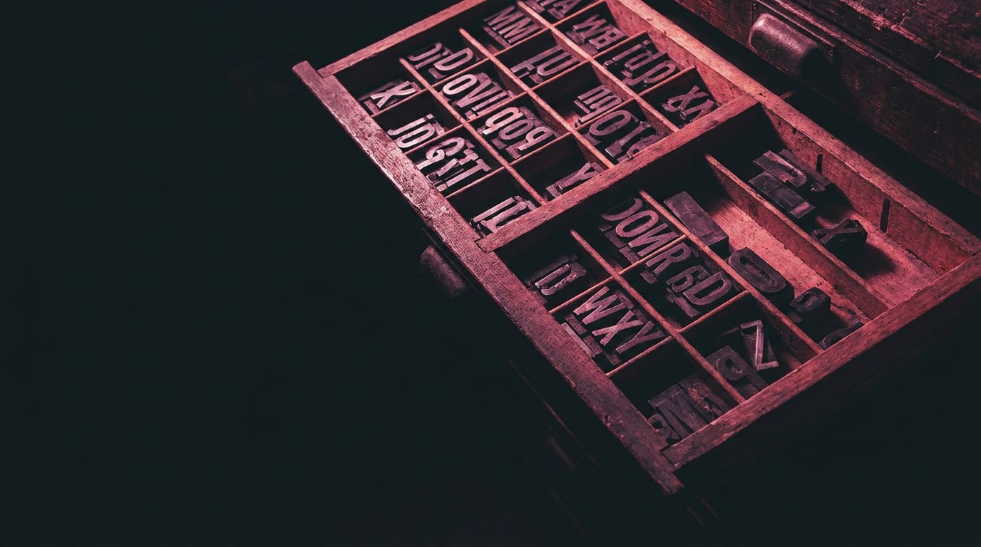
Most image generation models treat text as an afterthought. Letters blur, words merge, and anything longer than a single word becomes a smear of plausible-looking characters. Ideogram v3 is built around the opposite philosophy: legible embedded typography is a headline feature, not a bonus.
Ideogram positions v3 around three pillars: realism, design, and consistent styles. Legible text, style references, and batch generation sit at the top of its feature list. That makes it a different tool from most models in the image generation lane, which optimise for visual fidelity without caring whether the words inside the frame are readable.
The style range is wider than the "text poster" use case implies. Ideogram v3 handles photorealistic product shots, illustrated layouts, typographic poster compositions, and flat graphic tiles. A product packaging mockup, a social promo tile, a YouTube thumbnail with a punchy callout, an exhibition signage concept: all fall within its practical range. That breadth is useful for designers who need to move across formats within a single campaign.
The model comes in three variants: Turbo, Balanced, and Quality. Turbo is built for rapid iteration when you need volume. Quality produces higher-fidelity outputs when the asset is heading into a client presentation or a final production pass. Balanced sits between the two for general working sessions.
Where it falls short is predictable once you understand the constraints. Very long text strings lose coherence as layout density increases. Highly stylised display fonts, especially those with complex ligatures or extreme weights, degrade in busy compositions. Complex scripts are still unreliable. Photoreal faces combined with dense type compete for visual priority, and both suffer. One source is blunt on this point: very long copy blocks can challenge layout balance, and that is a fair summary of the failure mode.
Ideogram v3 is a strong first-pass text-image generator. It is not a finished-artwork replacement for a typesetter or a layout designer. The distinction matters for how you plan the handoff.
The practical implication: use Ideogram v3 to establish the visual logic of a campaign asset, including where type lives in the frame and how it relates to the image. Use a downstream layout pass to finalise kerning, line spacing, and long-form copy. That split keeps both tools doing what they do best.
It is also worth noting the generational context. Ideogram 4.0 is the current release in the product family, positioned around broader visual intelligence. Version 3.0 remains a production-ready tool, particularly for text-critical marketing work, but it is not the newest model in the lineup.
Ideogram v3 is the right choice when the words inside the image matter. Other models may be faster or more versatile, but none are as typographically reliable for short-to-medium text strings baked into a visual.
Building Campaign Hero Visuals with Integrated Copy

A campaign hero image with an integrated tagline is one of the most requested deliverables in marketing design, and it is exactly the use case Ideogram v3 handles better than most alternatives. The key is in how you build the prompt.
The most reliable method is to treat the text as a first-class compositional element, not an instruction to "add text somewhere." Specify the exact copy in quotation marks, describe the font style explicitly, and state where in the frame the text should sit. "Large bold sans-serif headline, top-left quadrant, white text, against a dark navy gradient background" performs significantly better than "product launch banner with text overlay."
For brand colour and mood, prompt language alone can do a lot. Referencing specific palette descriptors such as "warm terracotta and off-white" or "deep forest green with champagne accents" anchors the generation more reliably than leaving colour to the model's interpretation. Compositional direction is equally important: "wide negative space on the left for headline lockup" tells the model where to keep visual room for type, which is essential for hero assets that need breathing space around the copy.
A Seasonal Retail Campaign Scenario
Consider a retail brand running a seasonal campaign that needs ten hero variants: different backgrounds and moods, but a consistent headline lockup. Using the Ideogram v3 Quality variant on Stensyl's Image surface, the workflow looks like this:
- Build a master prompt scaffold with locked variables: brand colour, headline copy, font style, and compositional anchor for the text area.
- Swap the environment descriptor across generations: "sun-lit coastal scene," "minimal studio white," "warm autumnal forest," and so on.
- Use batch generation to produce multiple variants in a single session, then assess which backgrounds preserve text legibility before committing to refinement.
- For outputs where the headline rendering needs correction without rebuilding the composition, pass the asset to Luma Uni-1 Edit. Its instruction-based editing preserves the composition while targeting specific elements, which avoids the credit cost and time of regenerating from scratch.
The iterative loop matters here. Generating, assessing text rendering quality, refining the prompt, and editing selectively is faster than attempting to produce a finished asset in one pass. Ideogram v3's batch capability is built for exactly this: produce variants, identify the best compositional basis, then refine.
There is a point at which text-in-image should be abandoned entirely. If the campaign requires a long strapline, legal copy, or a call-to-action with specific tracking parameters, baking those into the generated image is a liability. Generate the visual layer in Ideogram v3, then move the asset into Stensyl's Graphics studio for a proper typography pass. The two approaches are complementary, not competing.
Build your prompt scaffold around the text first, the visual second. Ideogram v3 renders copy better when the prompt treats the headline as a compositional anchor rather than a cosmetic addition.
Ad Layouts: Social Carousels, Display Banners, and OOH Formats
Marketing assets rarely exist in a single format. A campaign that launches on paid social needs a 9:16 story, a 1:1 feed tile, and a 16:9 display banner, all carrying the same visual identity and short callout copy. Ideogram v3 handles this format discipline well when aspect ratio is specified in the prompt.
Social Carousel Frames
For a LinkedIn or Instagram ad carousel, each panel typically carries a short text callout: a stat, a benefit statement, or a question. These are exactly the text lengths where Ideogram v3 performs most reliably. Prompting for a consistent background texture or colour field across panels, with a swapped callout string per frame, produces a carousel set that holds visual coherence without identical image repetition.
Aspect ratio discipline applies here. Prompting for "9:16 vertical format, text centred in the lower third" produces a different compositional result from "1:1 square, text anchored top-right." Both are valid, but the placement instruction needs to match the format or the type will fight the frame edges.
Display Banners and Digital OOH
Display banners introduce a different constraint: compression. A performance ad for a SaaS product or a digital OOH format for an exhibition brand needs its call-to-action text to survive JPEG compression and small-screen viewing. Ideogram v3's Quality variant handles this better than Turbo when the final asset is heading to a paid media environment, because higher-fidelity outputs degrade less under compression.
For an exhibition design team producing wayfinding graphics or sponsor recognition panels, the same logic applies. Short, bold, high-contrast text on a clean background survives scaling and reproduction better than a busy photorealistic scene with embedded copy. Prompt for simplicity in the background when the text must survive format changes.
Moving Assets into Marketing Studio
Once Ideogram v3 outputs are approved for layout, the natural handoff point in Stensyl is the Marketing Studio. The Post/Ad framing toggle lets you move between social post formats and performance ad formats in one surface, combining the generated visual with research-backed copy rather than rebuilding the layout in a separate tool.
On credit consumption: iterating heavily on text rendering burns through credits faster than single-pass generation. Planning your generation batches before a campaign push, rather than iterating ad hoc, keeps costs predictable. A structured prompt template (covered in section five) reduces the number of correction passes needed per asset.
| Format | Aspect Ratio | Text Placement Note | Recommended Variant |
|---|---|---|---|
| Instagram Story | 9:16 | Lower third or centred; avoid top edge | Balanced or Quality |
| Feed tile / LinkedIn | 1:1 | Top-left or centre; keep background clean | Balanced |
| Display banner / OOH | 16:9 | Left-anchored with negative space for CTA | Quality |
| YouTube thumbnail | 16:9 | Right side for callout; face/product left | Quality |
| Carousel frame | 4:5 or 1:1 | Consistent zone across all panels | Turbo for volume iteration |
Keeping Outputs On-Brand Across a Campaign

Generating one strong asset is straightforward. Maintaining visual consistency across fifteen formats over a three-week campaign requires a system, not just good prompting.
Projects and Brand Identity Storage
Stensyl's Projects surface is where brand context lives permanently. Storing colour codes, tone descriptors, approved headline styles, and visual references in a project means that information informs every generation session without being re-entered each time. For a marketing designer running a multi-format campaign, this is the operational foundation. Without it, brand drift compounds across sessions.
Prompt Templating
A reusable prompt scaffold with locked brand variables and swappable campaign variables is the practical version of a brand system applied to generation. The locked section covers: palette, font style, layout logic, and visual mood. The swappable section covers: the specific headline copy, the environment or background descriptor, and the format orientation. Changing one variable while keeping the rest consistent is how you generate coherent campaign variants without rebuilding every prompt from scratch.
Using Ray as a Creative Director
Stensyl's AI assistant, Ray, can function as a brief-to-prompt reviewer. After generating an Ideogram v3 output, you can bring it into a Ray session, describe the original brief, and ask Ray to assess where the output misses the mark and what prompt adjustments would close the gap. Ray operates with Claude Sonnet or Opus at its core and has web search capability, so it can cross-reference trend context or brand conventions alongside the creative brief. This turns the refinement loop from intuition-based into structured critique.
A graphic designer building a product packaging mockup uses the same templating logic as a marketing designer building a paid social set. The brand variables are different, the format constraints are different, but the discipline of locking what cannot change and freeing what can is identical. Ideogram v3 responds to that structure consistently.
Boards for Visual Consistency
Pin approved Ideogram v3 outputs alongside reference imagery in Boards. This is not archive storage: it is an active reference layer that keeps the visual direction visible during generation sessions. When a new format needs to be generated mid-campaign, comparing the new output against the pinned approved set in Boards catches drift before it reaches the client.
Brand consistency in AI generation is a systems problem, not a prompting problem. Projects, prompt templates, Ray critique, and Boards are the four operational layers that keep a campaign coherent across formats and sessions.
Prompt Patterns That Get Reliable Text Rendering
The difference between a garbled headline and a clean lockup often comes down to three prompt habits. None of them are complex, but skipping any one of them increases the failure rate significantly.
Pattern 1: Exact Text in Quotation Marks
Specify the exact string the model should render, delimited by quotation marks. "Bold white sans-serif headline reading 'Rethink Your Range'" is more reliable than "a headline about the product range." The quotation marks signal to the model that this is a literal string, not a thematic instruction.
Pattern 2: Explicit Font Style Descriptor
Describe the font character: weight, width, case, and family. "Heavy condensed uppercase sans-serif" produces a different result from "elegant serif headline." The model has no access to your brand font file, but it can approximate the visual category. Stay away from named proprietary typefaces and describe the characteristics instead.
Pattern 3: Compositional Anchor for the Text Area
Tell the model where the text lives in the frame and what the background looks like in that zone. "Large bold headline in the upper third, set against a flat charcoal field" gives the model a clear compositional instruction. This is where most prompts fail: they describe the text but not the space it occupies.
Before and After
Weak prompt: "Product launch banner for a coffee brand with text overlay, warm tones, modern."
Structured prompt: "Wide-format product launch banner, photorealistic roasted coffee beans in soft focus, warm amber and brown tones, flat dark brown panel across the lower third, bold white condensed sans-serif headline reading 'Single Origin. Uncompromised.' centred in the lower panel, clean negative space above for product photography."
The structured version specifies: what the image contains, where the text sits, what the background in the text zone looks like, and the exact copy to render. Each of those additions reduces ambiguity and narrows the generation variance.
Background Complexity and Legibility
Busy photorealistic backgrounds degrade text legibility faster than flat or gradient fields. A product shot with intricate texture fighting a white headline is a harder rendering problem than the same headline on a solid coloured panel. If text legibility is the priority, simplify the background in the text zone. A subtle gradient, a flat colour field, or a blurred depth-of-field treatment all improve the odds.
Character Limits in Practice
Shorter strings render more accurately. A three to five-word headline is reliable territory. A ten-word strapline is experimental. Anything resembling body copy should not be attempted inside the generation. Treat the character limit as a design constraint rather than a model limitation: short, punchy copy performs better in the visual anyway.
If a text string needs more than seven words to do its job, it belongs in the Graphics studio, not inside the generated image. Use Ideogram v3 for the visual logic; use layout tools for the language work.
Ideogram v3 Inside a Real Campaign Workflow on Stensyl
Mapping the full workflow from brief to exported asset shows where Ideogram v3 fits and where other tools in Stensyl take over. The handoffs matter as much as the generation itself.
Stage 1: Research and Direction
Start in the Research surface, backed by Perplexity, to pull audience context, seasonal trend signals, and competitive visual references. This is not optional groundwork: it informs the palette and tone choices that go into the prompt scaffold. A marketing designer building a paid social campaign for a fitness brand needs different visual language than one building for a luxury travel client, and Research accelerates that context-gathering.
Bring findings into a Ray session to translate the brief into a generation strategy. Ask Ray to suggest prompt directions, flag any brand constraints worth encoding as locked variables, and identify which Ideogram v3 variant suits the campaign volume and quality requirements.
Stage 2: Generation
Move to the Image surface for Ideogram v3 generation. Use the Quality variant for hero assets, Balanced for mid-campaign iterations, and Turbo when volume matters more than pixel precision, such as generating twenty thumbnail options to identify the strongest compositional directions before committing to full production.
Ideogram v3 supports style references with up to three reference images per session. Use this for campaigns where a strong visual precedent exists, such as an existing brand campaign or an approved photography style. Style references anchor the generation to a known aesthetic without requiring the model to invent the brand from scratch.
Stage 3: Parallel Scale with Canvas
For teams running multiple creative directions simultaneously, Canvas provides a node-based workflow where the Image Generate node can batch multiple prompts in parallel. This is where a five-format campaign set stops being a sequential task and becomes a concurrent operation. Different background treatments, different aspect ratios, different headline variants: Canvas orchestrates the generation across all of them in one session.
Stage 4: Editing and Polish
Pass approved outputs through the Editing surface for upscaling, background removal, or background replacement. An Ideogram v3 hero image destined for a large-format display banner benefits from upscaling before export. A product-focused social tile may need the background removed before being placed against a campaign-specific colour field.
For final typography and layout polish, move into the Graphics studio. This is where long-form copy, brand typefaces, and precise layout adjustments happen. The generated image becomes the visual foundation; Graphics handles the type system on top.
Stage 5: Assembly and Publish
Bring polished assets into the Marketing Studio for ad and post assembly. The Post/Ad framing toggle lets you switch between social and performance formats, pairing the Ideogram v3 visual with research-backed copy generated in the same workflow. Final export to media platforms or client delivery happens from here.
Time Reality for a Solo Designer
A solo marketing designer producing a five-format campaign set, covering social story, feed tile, display banner, carousel, and thumbnail, using this workflow can move from brief to client-ready assets significantly faster than rebuilding every asset from a blank artboard in a traditional tool stack. The compound saving is not in any single step: it is in the elimination of blank-canvas starts, the reduction of back-and-forth on visual direction, and the ability to generate and compare variants before committing time to polish.
Ideogram v3 earns its place in the toolkit specifically when the words inside the image are part of the creative, not a post-production addition. For purely aesthetic campaign visuals where copy will be layered in post, other models on the platform, such as Nano Banana or Seedream, may deliver comparable results faster. But when the headline lockup is part of the visual design itself, Ideogram v3 remains the most typographically reliable option available in the Image surface.
The workflow above works for a graphic designer building a product packaging concept just as readily as it works for a marketing designer building a paid social campaign. The surfaces are the same; the brand variables change. That is the point of having one platform rather than five subscriptions running in parallel tabs.
```Keep reading.

Try Stensyl for yourself
Image, video, 3D, chat, and document drafting. Every AI model, one studio. Plans from £10/month.